


05 December 2007
Cosy in the Snow
I always walk to the Print Shop. My reasons are simple: I don't have a car, and my dorm is only seven minutes away, by my stride. Also, walking wakes me up. This morning, I stepped out an hour early, at 11:00 a.m., right into a constant flow of snowflakes. Today, I didn't walk to work, I skipped and twirled and stomped.
The snow calmed the landscape and softened the edges of even the ugliest buildings on campus. When I reached the Literary House, the snow was already bearing down on the black roof, muting the pitch of it to the same greys and whites that already belonged to the trees.
Inside the Print Shop, even the Vandercook 4's chipped blue-grey paint felt brighter, starker. Sunlight generally steps directly down through the tall windows in wide beams, but today it was diffused by the thick, low clouds. It was as though the roof and front of the shop had been lifted off, as if they were part of a doll house, exposing the shop to the visual beauty of the elements.
As a result of so much light, the shop felt larger to me, as though I had tasted a few drops of the potion in Alice's "Drink Me" bottle. When I printed 100 sheets for Beanball, each sheet felt less substantial than the sheets I had handled the day before. Also, I noticed that the light, thin as it was, was strong enough that I could hold a sheet of paper up toward the window and see through it as well as if I had pressed it to a light box.
Jim asked me to search among some endpaper samples to find a good color and texture that would work with the colors he has in mind for the cover and the crisp white of the book's pages. Endpapers are the blank sheets that start and end a book; they mark a visual progression from the cover to the title page, and from the final page to the cover. Perhaps because the light was so cold, my eye caught a burgundy sheet with dark flecks. It's dark enough to anchor the bright pages and it's as rich as blood, which could fit well with the story's noir tone.
"Sometimes it's best to go with your instinct," Jim said, and apparently our instincts agreed. He asked me to figure out the amount of paper to buy. I had to determine how many 7" by 10" sheets we could cut from a 20.5" by 33" sheet, which is 8, and divide that number into 200, the number of 7" by 10" sheets we would need. I am embarrassed to note that this was perhaps the most complicated math I have had to attempt in at least the past semester, and it went smoothly until I realized that 200 divided by 8 is just 25, not 24.64.
But I kept my cool, and Jim ordered the paper. He managed to secure the last fifteen 41" by 33" sheets of that particular kind of burgundy paper available on the East Coast, so we'll have plenty of extra in case we mis-cut any. The 20.5" by 33" sheets were completely out.
Mike called from his day job with an assignment regarding the final Advanced Workshop project, which is the development of a postcard that can be used as a punchy demonstration piece. I searched out a font to suit a Samuel Johnson quote. Maybe it was the brain-clearing influence of the crisp light, but I found the choice particularly easy.
I crouched before the case of 24 point Munder Venezian, composing stick in my left hand, and swiftly nipped each letter from its home. The point size was large enough that setting was easy; it is easier to identify letters when they are larger, and the letters are weighty enough that they do not slump to one side if I jostle the composing stick before the line is filled. However, my wrist began to feel just how weighty lead is after only one line was complete. The whole form felt as heavy as a third of a brick, but made up for that with character. The lowercase "g"s have a rounded cowlick, and the "e"s have a slanted crossbar like a nose upturned or a smile quirked.
I completed the quote within 20 minutes, washed my hands, swung myself into my borrowed leather coat, and chatted with Jim for another 20 minutes before I actually left the shop for a quick lunch and my 2:30 class.
I happen to hate being cold. I can tromp through snow happily as long as the stuff doesn't invade my socks, and I can twirl and skip in it as long as the wind doesn't tear through my jacket, but I much prefer a quiet evening in my room to a snowball fight. I like to look and look and look, reserving the touch for token moments. Today, joy of the snow and the window's planetarium-like view of it from the safety of the Print Shop both managed to warm me for the entire day.


02 December 2007
Time to Catch Eyes
With the body of my poem set, I was at a bit of a loss. The poem itself looked pretty, sitting quietly in Goudy Old Style, set and spaced the way I wanted it (but for the "t"s in the last stanza). What next? Oh, right. A title.
But what font would best represent the poem as well as catch the reader's eye?
I consulted Lindsay one evening during the workshop. She ran straight to a case tucked away behind the stairs and pulled out 24 pt Camelot, which is very leggy and curvy. Its serifs are subtle and it generally feels very elegant, so I went with it happily. I set the title and put it aside for the evening.
Later, 24 points just didn't feel like enough. I went to grab the 30 pt case and see if it was large enough, when I noticed an unlabeled case beneath it. I pulled it out with a little difficulty, in hopes that it was an even larger version of Camelot. It was better.
What it looks like: all capitals and large, larger than 30 pt Camelot and much bolder, with a "hand-tooled" sort of open space in each letter. Each line feels hand chiseled, no line is perfectly straight but bends or bellies a little, and this makes the font appear to move a little, even though it stands firm and bold on the page. It has life, and flourish, particularly in the "A." More importantly, it feels imposing and grand, much like the feeling I tried to create in the poem.
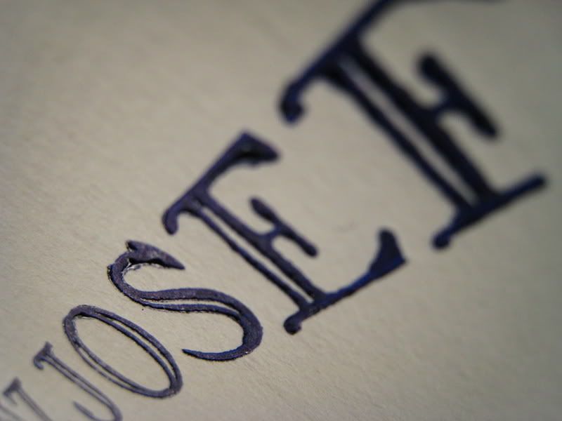
The only thing that bothers me about this font is that I do not know its name. Its impressions on my broadsides are like those of the crystal slippers outside Cinderella's ball, and I have the fallen slipper and no idea who she really is. I can make more impressions. I just can't give her credit.
Note: The letters in this picture are particularly juicy because I used too much ink when proofing. The edges in the final printing are more cleanly cut.
Things That Distress Me
I am not a naturally organized person. I like working in a certain amount of clutter and chaos, but order has its place, especially in a shared work environment. Here are some examples of how chaotic the print shop was before Tuesday (when Mac and I worked damage control and fixed this).

This is where we keep most of the leads, which allow us to make lines of type single spaced, double spaced, etc. They aren't normally scattered about like this - normally, each is stacked almost neatly in or on top of others in the section of its width. For some reason, the disarray here bothers me more than the disarray anywhere else in the shop.

This is dangerous. Not for a person's body, aside from toes if it fell, but for a person's mind. There was a case stacked on a stool as well, and unlike this one, it fell before I could move it to a safer place. It is not particularly fun to re-sort an entire case of 14 point type that has dust and dirt all throughout because the floor where it fell was particularly dirty.

And this is why that case was balanced so precariously on the press. There was no room on the table! Also, note the stack of four, yes four, cases on the left. As far as the other cases, they're each stacked on something else as well. I believe Mac, in the background, is attempting to straighten up.
These photos predate the recent Thanksgiving break. It took us several days before the break and a good deal of Tuesday to clean up so we didn't embarrass the Press when Mr. Dissette arrived. Oh, and so, you know, we could actually work without knocking things over.
01 December 2007
Another Freshman Profile
If Katrina's distressed or bored between classes, she'll come to the print shop to sort out her head. She's a constant presence during my work hours on Friday evenings. She sort of appears at the bookbinding station, cutting cloth, stitching signatures, plotting new designs, and when something excites her, she lets it burst out of her in a flow of chatter.
"Look at this stitch work," she'll say, waving an open instruction book in front of my nose. "Just look at it. Isn't it beautiful?" She usually sighs and looks back at it herself. "I need to know how. I have to try this."
Bookbinding is her greatest passion, and even though she's a Freshman, she has her education as a bookbinder laid out before her in a shimmering timeline. Katrina will spend her time at Washington College making the most of the print shop's resources - its binding studio and Mike himself - to build an ambitious portfolio. Then, she's off to graduate school specifically for bookbinding. She worries constantly about whether she'll get in, or if she'll be able to only bind books and not print. Typesetting interests her, but she has difficulty seeing the 12 pt fonts to manipulate them.
Mike's collection of instructional bookbinding books is vast. Katrina has already immersed herself in his library. Every Friday she finds another book to borrow, another technique to try, another design to absorb.
"If I returned all the books I have in my room right now," she asked me a few days ago, "do you think Mr. Kaylor'd let me borrow some books over Winter Break?"
As of last night, Katrina has put her latest ambitious plan on hold. Josh and Jim pounced on her last night with a proposal: they want her to hand bind at least one of the "Beanball" books, ideally to showcase with the other hand bound versions in One Story's display at the upcoming Association of Writers & Writing Programs Conference in January.
They've dished out creative freedom, but they want her to get the book feeling like baseball. Josh suggested stitching the cover in a baseball stitch. Katrina's contemplating white leather and how actual stitching or suggested stitching might curve across the cover.
The stitching idea reminds me of a book I saw at Oak Knoll. It's a book about the Black Sox called Ballet for Opening Day, made by Sherwin Beach Press. Every image was stitched into the book like a baseball, with much finer red thread on the cotton rag paper (plus Indiana corn husk specks).
I think Katrina can pull off an impressive cover that speaks specifically to "Beanball"'s feel as a short story, especially because it's not just a baseball story, it's got an air of darkness and mystery. And if she attempts stitching, she'll approach it in a completely different way than the pages of Ballet for Opening Day.
She's already got a baseball, borrowed from Mike, tucked away in her pocket for analysis. As soon as he handed it to her, she began turning it about in her hands, studying the thread, searching for a clue as to where it started or finished. She even ran up into the heart of the Lit House to find someone more familiar with baseball to see if they knew how baseballs were stitched.
When she realized she probably wouldn't be able to find the beginning because the manufacturers tucked the ends away so well, she began to think of the stitching as fluid and continuous. When I last saw her, she was spinning the ball in her soft hands, examining the way the stitching sat on the ball from various angles to find the best configurations for the front and cover of the book to give it graphic dimension.
That's something that Ballet for Opening Day's stitched pages don't quite have from their stitching, probably so that the stitching doesn't draw attention away from the etchings. Katrina's work can be as bold and focal as she'd like because she's dealing with the cover, which often has to sell the book.
I feel like I'm selling the college in saying this, but it amazes me that a freshman can get such an "amazing opportunity," as Katrina calls it, here. And not just Katrina: Mac and I are getting similarly exciting book printing experience and advice in helping Mr. Dissette. And the Lit House has offered to promote a project that Marian, Lindsay and I are attempting, one that I like to call "Top Secret Book Project."
I can't even imagine where Katrina's passion will get her if she can keep up with it.
Things I Find Beautiful

Inkless, the treadle platen C&P waits for its turn in the sun beams.

Instead of a very large gear, I like to think of this as a staircase. It also has no mercy, and has entangled many a printer's fingers or loose clothing. Most printers who damage themselves on the presses do so when attempting to fix or align parts of the press, instead of sustaining an injury while operating the press. At some point, I'll have to post the Marian and Jen rules of printing safety, developed one year ago about this time of year.

Mac built this out of leads and spaces when he was supposed to be listening to Kate say something of import. This tower remained standing for two days, which says something about the state of the shop at the time.

Natural light doesn't just make the printed images look beautiful. It lights up the lead here and makes those letters even more pronounced. It also picks up the colors of old ink layered and smeared into the type time after time, so much smearing that you'd think the type would just melt into a brownish grey color. Here you can see faded red and purple in the relief of each letter.

Umbrellas never seemed so fascinating. The cut below it is upside-down, but it's a landscape with bubble-gum bubble clouds. "Cut," by the way, a the term for the images. It might not be the official term, but that's what we use at the Print Shop. I think it derives from "woodcuts" - and we have some of those too, as well as linoleum cuts. These, however, are lead.
 These cuts of birds frozen in various stages of flight are about an inch long at widest, and a centimeter high at smallest.
Subscribe to:
Posts (Atom)
